
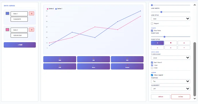
Our free online Double Line Graph Maker helps you create professional charts in seconds. A double-line graph maker is a digital tool used to create a chart with two lines that compare two sets of data over the same timeline or category.
Just paste data from Google Sheets, upload a CSV/Excel file, or enter it manually. Customise colours, labels, titles, and scales with live preview. Then export as PNG, JPG, SVG, or PDF, or upload it immediately.
01
Step
Add your X-axis labels. These are the months, years, or days that both lines will use.
02
Step
Type in your two sets of numbers. You can type them by hand or upload a file from Excel or Google Sheets.
03
Step
Give each line a name and a colour. Good names help people understand your chart. You can also let the tool pick colours for you.
04
Step
Pick a line style. Choose smooth, straight, or step lines based on your data.
05
Step
Download or share your chart. Save it as an image, or share a link so others can see it too.
Once you finish these steps, your chart is ready to use in a report, a school project, or a presentation.
A double line graph makes trends, changes, and relationships easier to understand by turning raw numbers into a clear visual chart. Instead of scanning rows of data, you can quickly identify patterns and present your findings more efficiently.
This double-line graph maker gives you everything you need to create, customise, and share professional graphs in one place.
Add Your Data Easily Choose the fastest way to add your data.
Make your graph look exactly the way you want.
Make your graph easier to read and understand.
Get useful insights without doing the calculations yourself.
Save your graph or share it with others in seconds.
A double line graph is commonly used to track changes, monitor performance, and compare related data over time. Here are some practical examples:
| EXAMPLE | WHAT THE GRAPH SHOWS |
|---|---|
| Revenue vs. Profit | Shows whether profit is increasing alongside revenue or if rising costs are reducing earnings. |
| Organic vs. Paid | Compares traffic sources to identify which marketing channel drives better results. |
| Budget vs. Actual Spending | Highlights overspending or savings by comparing planned and actual expenses. |
These examples show how a double line graph makes reports, presentations, and data analysis easier to understand.
A double line graph is commonly used to compare two related datasets over the same time period or categories. It helps you identify trends, measure performance, and see differences between two sets of data without analysing large tables.
Common uses include:
Whether you’re preparing a business report, school assignment, financial presentation, marketing dashboard, or research paper, a double line graph makes your data easier to analyse, present, and share.
No, this tool is built for exactly two lines. If you need three or more, try the Triple Line or Multi-Line Graph Maker.
Yes. You can upload a CSV or Excel file. The first column should hold your labels, and the next two columns should hold your two sets of numbers.
You can download your chart as a PNG, JPG, SVG, or PDF file.
Yes. Your data stays in your browser and is never sent to a server.
Smooth lines curve gently between points and look nice in slides. Straight lines connect points directly and show exact values more clearly.
No. You can start making your chart right away, with no account needed.
Creating a professional double-line graph is quick with the right tool. Simply add your data, customise your chart, and download or share it in the format you need. Whether you’re preparing a business report, school assignment, research project, or performance dashboard, this double line graph maker helps you create clear, accurate, and presentation-ready graphs in just a few clicks.